
Jeitto
Jeitto app
From V1 to V2: redesigning the fintech for people banks didn’t see
Overview
Jeitto is a payments fintech that offers a line of small loans through a mobile app, aimed at Brazil’s lower-income (C, D and E) classes. At the time of the project, once their credit limit was approved, users could top up their phones, load their transit card, pay bills and buy credits for digital services, and pay for everything later in a single monthly bill. Much of this audience lived on the margins of the financial system: they worked in cash and kept the economy moving, but were invisible to credit bureaus. The first version of the app had been built without any focus on usability or journey mapping, and that weighed on new customer conversion. The redesign began with a consultancy by the PQÑ (Por Que Não?) studio, which led the discovery and proposed a redesign and an overhaul of the app experience. When the consultancy ended, the project was handed over to us, to carry the proposal forward and take it all the way to the app in production.
From 3.0 to 4.6
Between August 2019 and June 2021, the app’s Google Play rating went from 3.0 to between 4.5 and 4.6.
User base more than doubled
After the new version launched, demand for accounts took off, and the user base grew more than 100% in under a year.
One designer, the whole app
As the only designer in a company of about 30 people, the work covered the entire app end to end, alongside product, development, data and risk.
Clarity for all ages
Tone of voice and flows were guided by people less familiar with technology, such as older users.
01 The problem
The app in V1
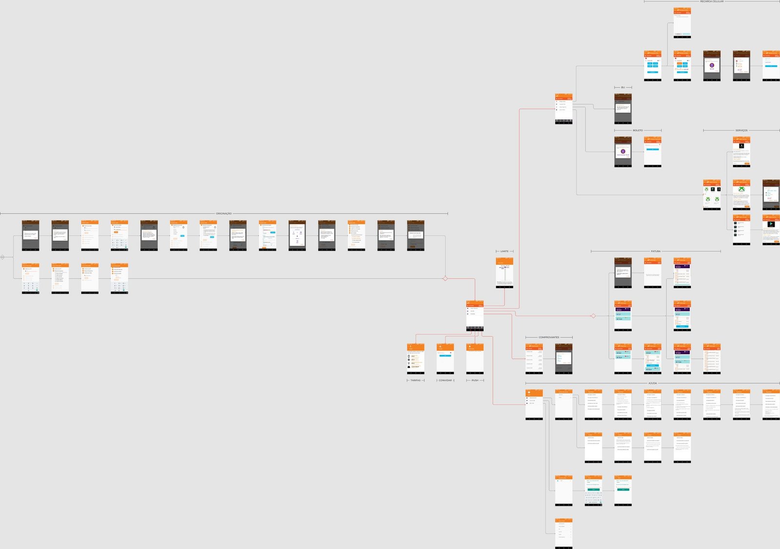
The first version was built by a developer, based on what leadership asked for, with no user research or journey design. The result was a visually careless app with a confusing, sluggish experience. The home screen was just a list of generic menus, such as “Purchases and Payments” and “Jeitto Account”, which buried the services several levels deep.
Sign-up in V1
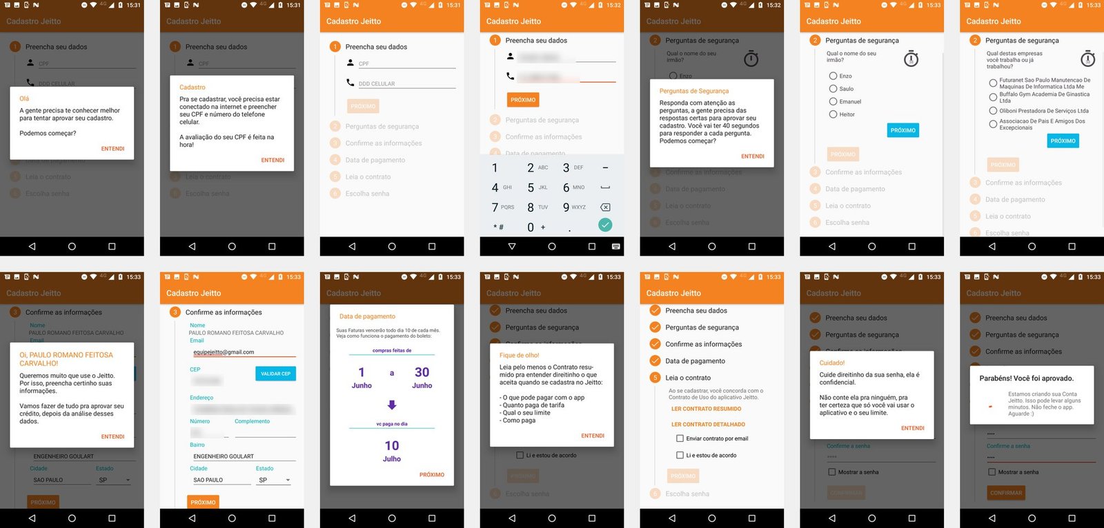
The most critical point was onboarding. Sign-up had six steps across 14 screens. After entering their CPF (Brazilian taxpayer ID) and phone number, people were warned they would have 40 seconds to answer each security question, built from a lookup in the Serasa credit bureau database: “What is your brother’s name?”, “Which of these companies do you work or have you worked for?”. The app then displayed their full name and address, already filled in, for confirmation. For someone who had just downloaded the app, it felt like being watched rather than welcomed, and many gave up before opening an account.
02 The process
Discovery and the studio’s proposal
The redesign started from the discovery led by the PQÑ studio, with interviews and usability tests with about 8 people on Marvel prototypes. The research mapped users’ pain points, and the studio proposed a redesign and an overhaul of the app experience. When the consultancy ended, we received the base file and the research to carry the project forward.
From proposal to the real app
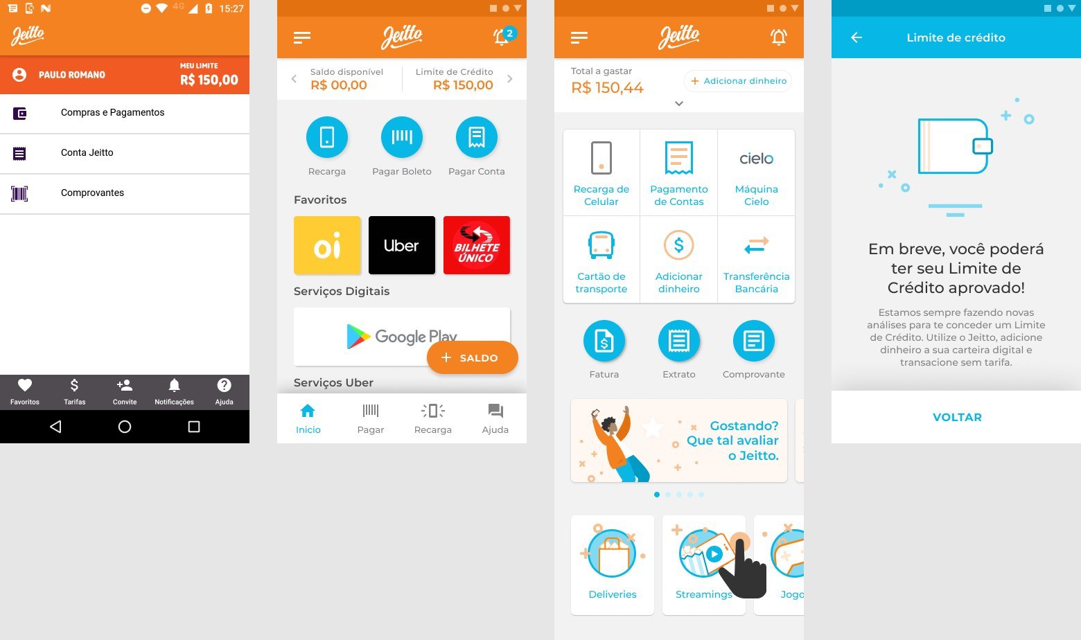
The studio’s file became the reference, and a new Figma file became the day-to-day working base. The job was to balance the original proposal with the needs of the business and the constraints of the code and the development team. The home screen is the best example. The studio’s proposal split balance and credit limit into a carousel and organized services by brand, with large blocks for carriers, apps and games. In practice, the app had to serve different account types (digital wallet, prepaid account and account with a credit limit) and take in new products without redesigning the screen with every launch.
We rebuilt the home screen from scratch: the top now showed a single figure, “Total to spend”, with a shortcut to add money; services moved into a grid organized by task, such as phone top-up, bill payment, transit card and transfers; and brands were grouped into categories, such as delivery, streaming and games. A banner carousel made room to announce news and ask users to rate the app. Over time, the app evolved and moved further and further away from the starting file. By August 2020, the migration from the old flows to the new ones was complete.
A small, close-knit team
With about 30 people, the company worked in the same space, and design talked directly with product, QA, development, data, risk, leadership and the founders. Beyond the app, the work included email marketing pieces and a few activations. That constant exchange made decisions fast and made it possible to follow each delivery, from the designed flow to implementation.
03 The solution
New journeys
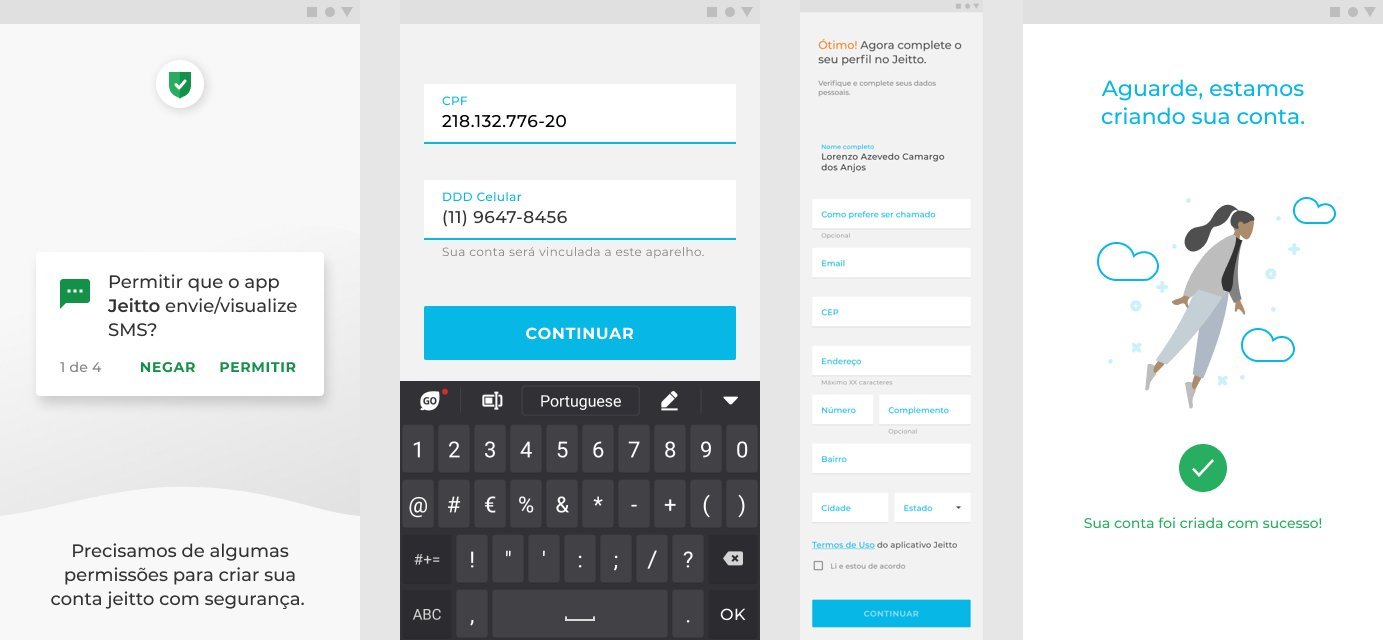
Sign-up was the first journey to get a new face. The timed security questions were removed, and the flow was rebuilt as a basic sign-up starting from the CPF. The app explains why it asks for each phone permission, one at a time, asks for CPF and phone number, confirms the number by SMS and pre-fills only the user’s name; users enter the rest, such as email and address, themselves, with postal code lookup. Identity verification switched to a photo of an ID document and a selfie holding it, and the review took place in the back office while users saw an illustrated waiting screen until their account was created.
With the foundation migrated, we moved on to evolving the flows. We created and improved journeys to address the pain points users raised, such as promotional coupons and personal loans, always with the business-rule configuration each product required. Personal loans got offer, application (with selfie and ID photo) and digital contract signing flows, and were starting to be implemented in 2021. Not everything designed for V2 moved forward at the time, and some flows made it into the app later. We also designed the Pix instant payment journey, which had not been implemented by June 2021 but was fully documented for future use.
An app for people less at ease with technology
The app was Android-only, the operating system most of its lower-income audience used. The tone of voice explained each step simply and directly, because the constant concern was people who struggle with technology, such as older users. That care guided the design of every flow. The interfaces applied Jeitto’s new brand, created shortly before, and gained After Effects animations exported as Lottie for development. The main one was on the app’s splash screen, where the Jeitto logo of the time was written stroke by stroke while the app loaded.
An early design system
Alongside the flows, we set up an early design system, in the days of Material Design 2 and a Figma without variants. The focus was on building the basic elements and organizing components into folders so the team could find and reuse each piece. It was the foundation that made it possible to componentize the app in later iterations.
4.6 out of 5 on Google Play
App rating before and after V2
- Aug. 20193.0 stars
- Jun. 20214.6 stars
+100% more users
The user base more than doubled within a year of V2
Results
After the new version launched, Jeitto saw a surge in demand for accounts, and the user base grew more than 100% in under a year. The app’s Google Play rating, which was 3.0 in August 2019, reached 4.5–4.6 by June 2021.
Impact
A clearer, friendlier credit app that doubled the user base and took its Google Play rating from 3.0 to 4.6.
Credits
- Product design
- Caio Colin
- Discovery and initial proposal
- PQÑ studio (Por Que Não?)
- Product owner
- Priscila Macedo
- Tech lead
- Paulo Romano
- QA
- Tainã Lautenschlager
- Android development
- Fábio Rachid, Rafael Caetano, Tília Nogueira, Patrício Dutra